Color Contrast and Font Selection
This is an image of an Ishihara color test plate used to assess different types of color blindness. The number “74” should be clearly visible to viewers with normal color vision.
Overview
Color choice, font selection, and how text is formatted in a course site impacts its accessibility. The colors used for text, the level of contrast between the text and the page background both have a huge impact on the site’s readability. Formatting text you want to emphasize (using bold, italics, etc.) makes a difference in accessibility also.
How to Select Accessible Color Contrast & Fonts
Both the text colors and contrast between the text and the background impact accessibility.
Color
There are two accessibility issues with color. First, an estimated 300 million people in the world are color blind. Ninety-eight percent is red/green color blindness.
- Eight percent of men are color blind (1 in 12 men)
- One half percent of women are color blind (1 in 200)
To make your pages accessible to all students, do not use color for emphasis in text. Tools like Coblis (Color Blindness Simulator) can help simulate how your design looks for people with different types of colorblindness. When creating course materials, avoid using combinations like light green on yellow, or red on green (which is difficult for colorblind users to distinguish).
Contrast
Second, the contrast between text and background impacts readability for both sighted and visually-impaired students. Consider the differences in readability in these examples. Which is most readable?
Can you read this? (yellow text says, “can you read this?”)
How about this? (blue text says, “how about this?”)
or this sentence? (gray text says, “or this sentence?”)
Which of these examples has the greatest contrast and is easiest to read?
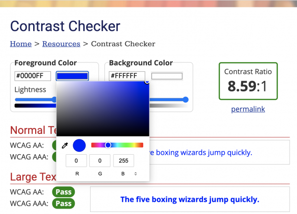
According to the UCLA DCP Checking Color Contrast page, there needs to be a contrast ratio of at least 4.5:1 for large text and 3:1 for other text and images. The page has explicit instructions to check on both Windows and Mac machines.
Accessible Emphasis
There are several ways to emphasize text that are more accessible than others. Below the use of Bold, all CAPS, italics, and underline is discussed.
Bold: Using bold formatting to emphasize a word or phrase in text is acceptable; however, remember to use it sparingly. Using bold formatting excessively essentially emphasizes nothing since everything is emphasized. Overuse of bold formatting causes eye fatigue and reduces comprehension.
All CAPS: The use of all CAPS as a means of emphasis is discouraged. It is thought of as shouting. All caps formatting is also more difficult to read and hard to scan.
Italics: Italics should be avoided except for a word or two, such as a foreign language word or phrase. It may also be used for a magazine or book title. The use of large blocks of italics impacts readability particularly on a computer screen.
Underline: The use of underline should be avoided on web pages due to the convention of underlined text indicating a link.
Accessible Fonts
When choosing a font, sans serif fonts are recommended for accessibility, as they are more block-like and readable than serif fonts. Some examples of sans serif fonts are Arial, Calibri, Helvetica, and Verdana. The default font in Bruin Learn is sans serif.
Font size is also an important consideration, and 12pt font is generally suggested as a minimum size for body text. 12pt is also the default size for paragraph text in Bruin Learn.
See How to Pick the Perfect Font Size: A Guide to WCAG Accessibility for more information on fonts and sizing.
Summary & Key Takeaways
- Be mindful of color choice. Select high-contrast colors (black text on a white background, for example).
- Check course materials to assess if you are using color as the only indicator for information, for example a graph where students need to compare a red line to a green line. Use dots, dashes, or other symbols to be considerate of those with color blindness.
- Avoid fonts or styles that are decorative but more challenging to read. Value accessibility over aesthetic choices.
- Use accessibility checkers when creating course materials.